Thursday, 24 November 2016

Artist Research: Shawn Coss

SHAWN COSS

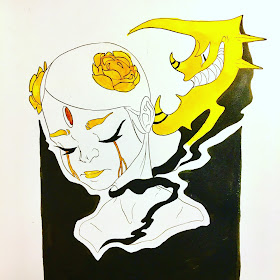
For this artist research, I looked at Shawn Coss, an artist that draws about mental disorders using really scary, twisted visuals.


I looked as him as I thought I could learn from his art style in order to make my work look better.
He uses very heavy shadows so that it creates a very creepy feel to his work, and the way he illustrates his art is also graphic and horrifying.


As a result I did a response to Shawn Coss, applying the technique and his visuals on a drawing of a victim of Alcohol/Substance Dependance Disorder. 
It works, but as I progressed and comtemplated, this style of work doesn't really fit me and my art style, and it definitely would not work for my major project.

However, I think it'd be better to record and post this artist research.


Thursday, 17 November 2016

TENTACLES OF ANXIETY

TENTACLES OF ANXIETY

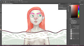
This post is to showcase my first final piece and the process of making it.
It started out as a concept, and a sketch of this girl, looking scared, being consumed slowly by her anxiety, which is the monster from the deep with millions of eyes staring at her.


I immediately got to work and started to paint her from my line art. 
I chose a really pale palette so that it brings a dull and mysterious atmosphere.


After finishing her face, I started on painting her body, I think I really need to step up my contouring game as it does not look as realistic as I wanted it to be.

 Line art for the foreground and background was made afterwards.


I then proceeded to colour the rest of the foreground and background, using a really dull and pale colour for the water, trying to make the contrasting tentacles pop out more.


I was working on my piece but then I realised that the hair looked out of place, and I wanted it to look more natural, I also wanted to change her face so that she would look more scared, which is what I was trying to go for from the beginning. So I made a few adjustments, for example her hair doesn't fit into the whole colour scheme, therefore I changed it so it would match the tentacles, to make the painting look like it was not seperated and all-over-the-place. Aside from the colour of her hair, I didn't really like the shape of it, it looked unnatural in that situation to me. 


After making a few tweaks, I found that the picture was more in-sync as a whole and I was pleased with it. 

After finishing the painting, I added the narrative and formed it into a part of the background. The narrative tells that she is being slowly consumed by what the people says and the negative thoughts that she has (the tentacles) until she was met with a terrible, pitiful death.

The whole process took me approximately 20 hours, and I work on it for 3 days.

This is the first piece of THE MONSTERS INSIDE ME THAT THEY CAN'T SEE

Tentacles of Anxiety

DISTORTION

DISTORTION vs INSECURITIES and MENTAL HEALTH

At the library, I also managed to play with the 'Distortion' feature on Photoshop. The reason that I think putting distortion into my work is relevant is because distortion can create confusion, personally, I think it also shows the true form of insecurities, it shows how we ourselves really see us, a bunch of twisted, deformed, ugly humans.

I went on a dug deeper on the theme of distortion, and I looked at Jenny Saville. Instead of squeezing flesh into glass, I used Photoshop's 'distortion' tool to create the same effect. With each type of distortion comes a different facial expression ranging from confused to scared.

There's this one pixelate filter that I really liked, when applied on a face, it looks like the girl wants to censor herself from the world as she is too afraid of what people say about her and she doesn't want to ever show up or to be seen so clearly by everyone. 


Jenny Saville, Closed Contact

THE DISTORTIONS


Spherize / Distortions


Twirl / Distortion


Zig Zag / Distortion


Wave / Distortion


Liquify 


Pixilate / Moisaic

COLOUR ENHANCEMENTS


Over the time of being at the library, I had the opportunity to play with a few of Photoshop's features and tool. I went on and explored how colours affect my work.

As I want to give the feel of confusion, sadness and darkness within my work, I used the 'Camera Raw Filter' tool to alter my work's colours and tones, making a set of different variations of my work.

As I went on, I also noticed how really intense and contrasting colours can also create confusion so I went and made the piece lighter, it didn't work as well as when I made the piece darker. 

However, colours can cause confusion and many other extreme emotions, I am certain that my work will show a variety of these colour schemes in other pieces of my major project.


MONSTERS WITHIN ME THAT THEY CAN'T SEE BRIEF

MONSTERS WITHIN ME THAT THEY CAN'T SEE  

MWMTTCS is a project in the making that serves the purpose of raising awareness and fighting against the stigma of mental illnesses' victims. 

This project is going to illustrate mental illnesses as physical monsters, touchable, tangible monsters that are attached to their victim, leeching, inflicting mental, as well as physical pain on their victims/hosts. 

The project includes 5 illustrations that shows the monsters hurting their victims, each monster can represent a type of mental condition. 

GROUP CRITIQUE

  
GROUP CRITIQUE

Last week, we had a group critique in class, and we were to give eachother's opinion on our websites and blogs. My group members were Kate, Angel and Eslam.


Blog and website feedback and reflections:

First of all, I have received many comments on how my blog lacked artist research, and I think that it is a problem that can be fixed, as my major project is coming along, I have also looked at more artists, evidently, I have posted a new artist research of an artist called ‘Loish’. However, I received compliments that my research was relevant and consistent.

However, with only 11 posts, even I feel that I should post more posts, instead of cramming all of my ideas and blog them into one post all at once.

I received many positive comments on my website, mainly saying that I have an aestheticallly pleasing homepage, and my website is also easy to navigate.

Wednesday, 16 November 2016

PRESENTATIONS


Feedbacks

Khalid
Major Project

His project us about making manga, and he is influenced by Miyazaki, which I think is a good thing as he was a really famous and popular artist for his concepts and animations.

Khalid's research is consistent, for everything he makes, he seems to make a blog post about it, which is fantastic as it shows that his work is progressing each and everyday. He also looked a wide variety of mangas for his research and explored how visuals could be portrayed and how the narrative should be placed into the pages.

He presented many characters and went through his character designs, and the storyboards shows that he knows what he is doing.

Website

It is important that you should not showcase others' work on your website, Khalid needs to be reminded of this.

His about page to me, is a bit overwhelming, and it doesn't feel like it belongs to his website.

All in all, his website is still too raw, and not as aesthetically pleasing as it might bore readers.

Kate
Major Project

Kate's research is consistent as she not only has research, she also puts effort into figuring out to do things that she's never done before. She has a set of illustrations that show how the idea has come together. She also showcased how she works with her chosen programme. 

Website

Kate knows what works for her eyes and what doesn't as she constantly reflect on her website, slowly building it into a better, more aesthetically pleasing website.

Shouldn't upload too many things on website unless it's professional work.
Her website is minimal, which is a good thing as audience are less likely to feel overwhelmed by the layout of her page.

Santiago
Website

Love his website, looks professional, however, for clarity, on his about page, he should change the colour of his text to white so that it doesn't fade into the background.

The blog is a bit too much, readers might not be keen on reading his blog, therefore making it purposeless. 

Major Project

Santiago went many places and used many methods to be able to observe the buildings for inspiration. However, his website lacks reflection as well as artist research. So far it's only been his primary research.

Angsyeska

Major Project

Consistent work with visible progress, research has been put into blog but reflection is still a bit limited.
Need more commentary.

Website

Needs more work to make it more aesthetically pleasing.

Jessica
Major Project

Thoughtful, really specific and consistent research, great reflections. Clear idea of what final piece is gonna be about. 

Includes website creation, which is good.

Website

Good website overall, showcases project very professionally.

Great design, very neat contact page.

However, make the background your own picture.

Sujin
Website

Very beautiful and aesthetically please, minimal but full of useful information, well done!
But it was a really brief presentation on the website

Blog

Consistent research, specific plan. 
Fonts are too tiny to read, blog presentation is not as pleasant and pleasing as website.
Clear idea on what she's going to do for final piece.

Has a good amount of reflection/notes and evaluation on what works and what doesn't.

Speak louder next time?

Jaewan
Blog


Many, many, many many many many posts, which is a good thing as you are constantly updating your blog.

Consistent research and experimentation as well as reflection.

Website

Good animation on website, but is it yours?

Font too hard to see, try not to put it in Italic.
The map might be a bit purposeless.

Angel
Blog

Really clear concept as well as idea generation. It's really clear what she wants to do.

Research is okay, seeing her have a fair amount of reflection as well as experimentation.
Good software exploration.

Website

Great music!
Really nice gallery. 

Great about page! 

Webpage is well-designed.

Jason
Website

A bit too colourful, therefore overwhelming.

Bio too long, might bore readers.
Great showcase of work and the contact page might need a colour change.

Blog

Visible process and reflection, as well as clear idea. 

Has idea generation which is great.

Monday, 7 November 2016

Artist Research: Loish

LOISH artist research

About the aesthetics of my major project pieces, I wanted them to look dreamy, mysterious. So I looked at Loish.


This artist relates to me as she uses very pale and vibrant at the same time, some of her work do give this mysterious feel, which is what I’m going for.
Loish also portrays girls in a majority of her pieces, which is what I want to illustrate in my major project, girls (and a few boys) interacting with their fears, doubts and insecurities.

As I moved on, I found that Loish’s art style really attracts me, and I wanted to be inspired by her style, I want my work to look similar, but not limited to her style.

 
Loish’s art style study

I went on and did a study of Loish’s piece in her ‘Gumdrop’ series, which is a portrait of a girl.

By doing the study, I learned that Loish usually splits her colour schemes in half, half being really pale and half being really vibrant, and it creates a mysterious and dreamy feeling.

Technique wise, I have learned that the more you worry about lines in your paintings, the less realistic it becomes. From now on I think I should not think about lines that much for my paintings, I should only use them on my sketching processes.

Bibliography:

artworks taken from Loish. 2016. Loish. [ONLINE] Available at: http://loish.net/. [Accessed 7 November 2016].


Thursday, 3 November 2016

Artist Research: Toby Allen

TOBY ALLEN artist research

I looked at this artist as he is related to my theme of work.


Initially, I wanted to portray mental illnesses as shadows that are trying to harm you, through expression, gestures and actions. As my project progresses, I think that by making these monsters more physical, the illnesses can become more vivid and realistic. And Toby Allen is an artist who has and who turns mental illnesses into monsters with clear shapes, forms and colours.


Real Monsters by Toby Allen

According to Toby Allen’s website (Toby Allen. 2013. Real Monsters. [ONLINE] Available at: http://www.zestydoesthings.com/realmonsters#_=_. [Accessed 31 October 2016].), the aim of his project is to raise awareness about mental health, he also wants to reduce the stigma surrounding mental illnesses and the victims of those illnesses and he also wants to educate more people about lesser known mental illnesses.
I wanted to know more about his process as well as the concept, meanings and style, so I have recently contacted him through his website, and right now I’m waiting for his reply so this section is likely to be updated.


Just because you can’t see it, doesn’t mean that it’s not real. My aim is to raise awareness, just like Toby Allen. But personally, for this project, I also want to focus on both the victims (their mood, emotions, postures and social life) and the monsters as well as the effects of they have on these people. I want to make it obvious to people who can’t seem to understand mental illnesses and how it affects the people that have them as people still take mental health as a not-very-serious matter, and they tend to say things without caution that sometimes might hurt the victims, such as ‘stop being sad’ and etc. by making these monsters really physical and real that they can make physical contact and do physical harm to ones that bear the evil seeds inside them planted by these monsters.

For this research, I’m going to focus more on monster creation and concepts behind the monsters that come from my imagination and how mental illnesses can be seen as these monsters. 


Original sketches

Afterwards, I also explored how these parasitic monsters can latch themselves onto their host.


Artwork by me / Nathan Vo

Wednesday, 2 November 2016

EXPANDING my WEBSITE

After a while, I came back to my portfolio website and I changed a few things as well as continuing to work on it. This time, I've added other necessary pages, including my contact page, my about page and the project page.

I've changed the colour scheme of the site into a more vibrant one as the last one was grey-ish dark, which made the website dull, so I changed that into a rather rose gold - white - black colour scheme, which I think is working very well, considering how much I like the colour rose gold.

I've also created a subpage named PROJECTS which showcases all of my work.

I have taken a picture of myself for my profile picture in the contact page, using my DSLR camera.

At this point, I think my website is ready for me to post my upcoming work.


HOMEPAGE


ABOUT PAGE


PROJECTS PAGE


CONTACT PAGE