Adverts and misfortunes.
In class this week, we were given the task of making an advert that promotes a product, either an existing one or one created originally by us. As my group's (Nathan, Jessica and Khalid) progression routes are Game Art and Animation, we decided that it was necessary to promote something that would be useful to us and other artists, something like, an art tool.
Where it came from.
It was also at that time that we were just chatting in class about pencils called Blackwing, known to be the best pencils out there in the world (these pencils were in production from 1934 until 1998, right on the year when I was born, ouch!?). Then, it hit me. I thought what if we did something that would be even better than the Blackwing, and to mock it for stopping production on my birth year.

[source: https://blackwingpages.files.wordpress.com/2012/02/dscf00131.jpg]
I had this vision of this advert, where there was a pencil in the middle, its body made of a feather. An imagery, we were trying to say that the pencil was so light, that it would feel like we were to hold a feather while drawing. Khalid and Jessica were fully on board with my idea, which made me really happy.
After a while of debating, we agreed that the whole concept of the Sparrow pencil (originally named after our initials - KJN, spelled as Kajun) is to attack the Blackwing pencil, and I took it really PERSONAL as I still had an undying grudge towards Blackwing pencils for stopping production in 1998. Given that their slogan was "Half the pressure, twice the speed.", we took it further and decided that our slogan would be "One fourth the pressure, triple the speed.", just to attack the fossilized pencils.
From our research we also found out that there was a company that was reproducing the pencils (obviously, they can't beat the OG Blackwings.) called Palomino, which is a horse. Then Jess, decided that it would be better to have our product called Sparrow as horses couldn't fly and horses couldn't be faster than birds (and lighter.).
The visuals.
As mentioned above, I had this vision of an advert where a pencil was placed in the middle and its body was made of a feather. We also looked at the vintage style as the product was at its prime during the 30s to 80s, and we wanted to make the advert look aesthetically pleasing to the people at the time.

[source: Fila Pencil]
Vintage posters/advertisements normally give out an old vibe, and they usually contain brown-ish colours with a little mix of yellow. Vintage adverts tend to have limited colours as using too many colours would make them more "futuristic", which was not what we were going for.
Jessica was in charge of making the logo and delivering our message in the advert, and I found myself really pleased with her work, despite having her computer broken and she had to sloppily create the advert by using the university's computer in the library, which didn't let her save screenshots. We came up with the idea of a bird silhouette, made from geometric shapes, and Jessica immediately put it that concept to work. Before making the logo, we also looked at a few existing sparrow logos for reference.


[sources: http://devfloat.net/wp-content/uploads/2016/04/sparrow_-_logo.jpg
http://www.brandcrowd.com/gallery/brands/pictures/picture12567680212963.png
http://www.sothink.com/page/logo-design/images/BlackSparrow.jpg]
http://www.brandcrowd.com/gallery/brands/pictures/picture12567680212963.png
http://www.sothink.com/page/logo-design/images/BlackSparrow.jpg]
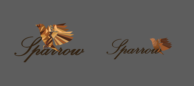
The outcome was what I thought it would be, but having way too many colours on the logo completely challenged our focus of making this advert more vintage, so we agreed to change it into more of a brownish coloured logo. These are the final prototypes for our official logo:
Moving on to the poster, we gathered a set of feathers to be the body of the pencil, and we finally chose this feather as it looked more like it belonged to a sparrow, rather than the other ones looking like they belonged to doves. Jess also chose a really fitting background for an advert, which looks like old paper and it has a really vintage-ish vibe to it.

The outcome.
After hours of fixing and editing, we finally finished the advert.

Final thoughts.
We were all really pleased with our outcome, I personally think that we have delivered what we wanted to tell and share. I also think that we've stayed really consistent throughout the process of making this advert, not just dying while doing it, we also had a tremendous amount of fun as well as gaining important groupwork experiences.
If there was one thing I could do to change this, I would only turn the sparrow on the logo black as it would make the logo pop out even more, and it makes people notice the logo more, which is a really important thing in adverts, they want their brand to be VERY visible to the audiences' eyes.


Your advert blog post shows how you came to the final poster, and includes the elements and ideas which you used. Please add a reflection on the feedback received in class last week to this post.
ReplyDelete